The narrative is fragmented
Public conversation turned into a list of differences: sect, region, position. What people share has no voice to carry it.
Different stories, one country, one future.
The line isn't a slogan written on a post. It's the structure of the campaign itself: each face carries its whole story, and every story ends at the same point.
After years of fragmentation, the public narrative had taken on the language of division and blame. People became categories, headlines and positions, and the human face disappeared behind them. The problem was never a shortage of stories: Syria is full of them. The problem was that "we" was slipping out of the public conversation, and there was nowhere left for these stories to be told side by side.
Public conversation turned into a list of differences: sect, region, position. What people share has no voice to carry it.
Numbers and headlines arrive before the people do. Someone who lost a loved one becomes a line in the news, not a person with a name and a story.
A word on a screen gets there before the truth does, and outrage spreads faster than any fact-check. Silence here isn't neutrality.
Everything that follows was built on this one decision: a portrait instead of a slogan, a face instead of a speech. The camera holds on one face at a time and lets the story be told in that person's own voice. No confrontation, no political language, no blame. The hope is that viewers recognize themselves in someone else's face, and discover that what they share is bigger than what divides them.
What they actually lived through, told in their own words: loss, displacement, detention, or a youth cut short.
The inner act: how they carried that pain, or pushed back against it. This is where dignity lives, not in complaint.
An opening toward a shared future. Hope arrives late, not as naive optimism but as a release that has been earned.
Scope of work: the campaign's visual identity and its guidelines, the main campaign film, the content system across platforms (posts, carousels and reels), outdoor billboards, and tying it all back to the campaign site.
The logotype is set in a contemporary slanted Kufic that suggests vitality and continuity. It opens with a quotation mark that announces the beginning of the story, and closes with one that completes it. The meaning is direct: Syria's story begins with its people and is completed when they come together. From those two marks the entire pattern was born, so the visual system carries the same idea into every application.
An Arabic typeface with a handmade feel, its strokes organic and carrying the trace of the maker's hand. It was chosen for its warmth, craft and human touch, exactly what a campaign built on stories needs.
The preview above uses the site typeface, since the campaign typeface is not embedded on this page.
An editorial serif, elegant and clear at large sizes. It lends the campaign credibility, culture and a storytelling tone, and balances the handmade Arabic with typographic discipline.
The preview above uses a substitute serif, since the campaign typeface is not embedded on this page.
The film doesn't explain the past. It gathers a mosaic of lived stories: the bereaved, the displaced, those who stayed, women who carried their families, former detainees, a generation raised in war, workers rebuilding their lives. Every portrait follows the same emotional architecture, and the repetition builds until the viewer stops seeing separate individuals and starts seeing one Syrian condition.
It grounds each portrait in its place and holds the variety: a plain, a market, a cemetery, a painted wall.
The face holds memory, dignity and presence. No performance, just a human presence, quietly observed.
Identity lives in the small truths: a hand, a piece of cloth, an old photograph, a gesture worn in by habit.
The tone is calm, reflective, human. No shouting, no spectacle, no blame. The pain is there, but the film never sinks into despair: it leaves room for viewers to see themselves in the person on screen, and to feel that any of these portraits could be someone they know.
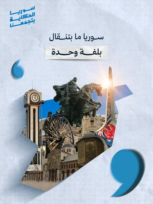
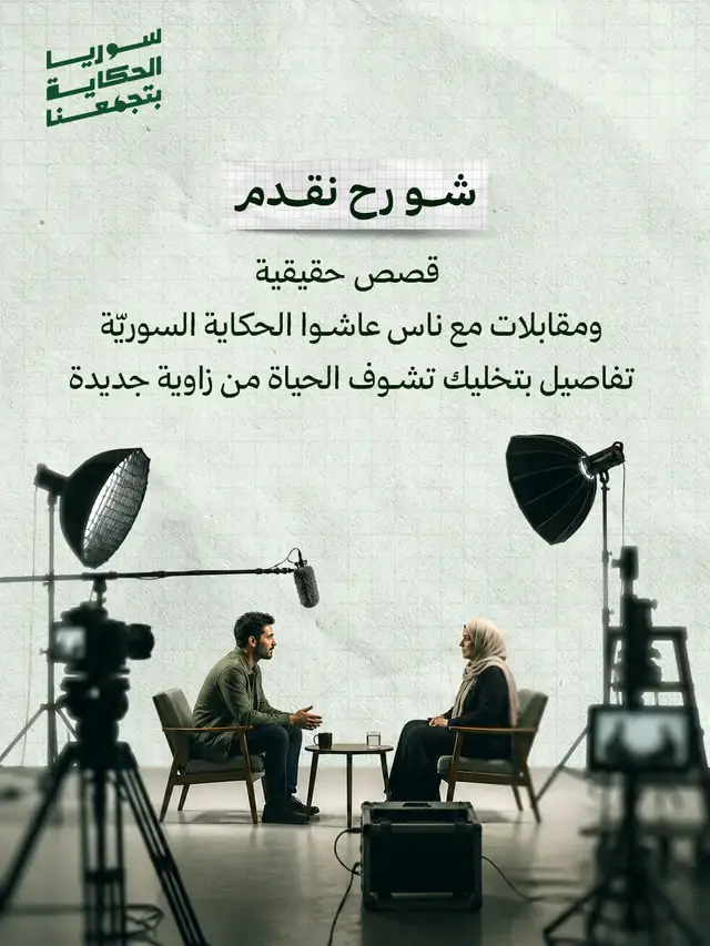
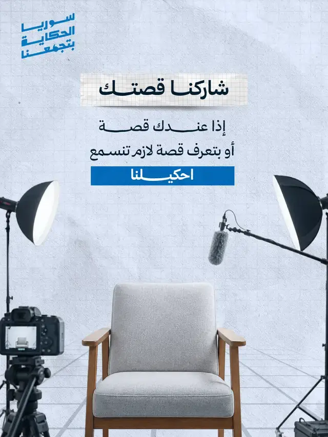
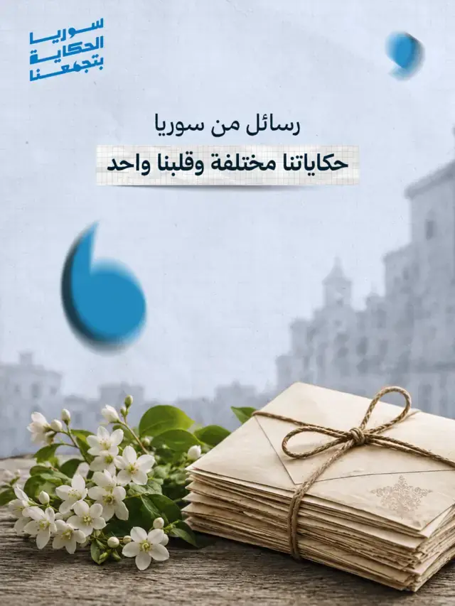
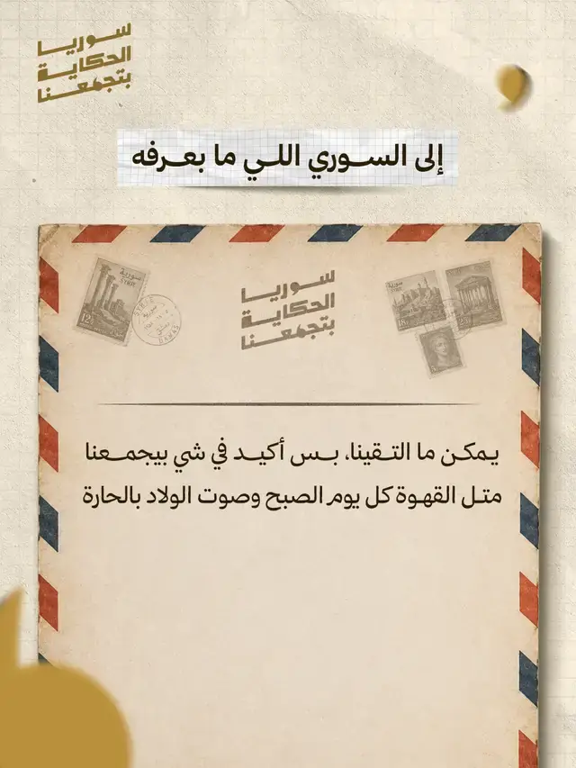
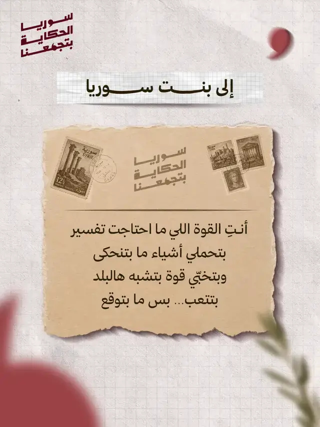
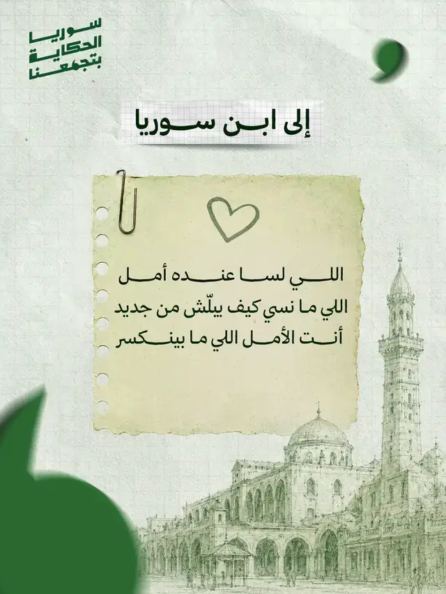
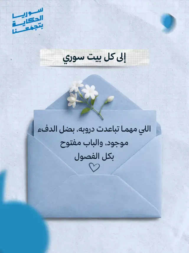
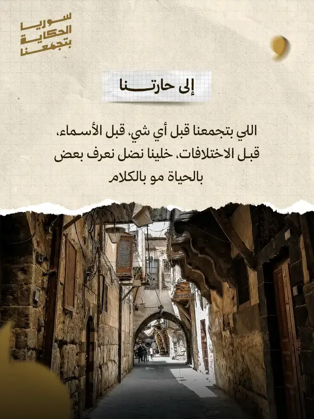
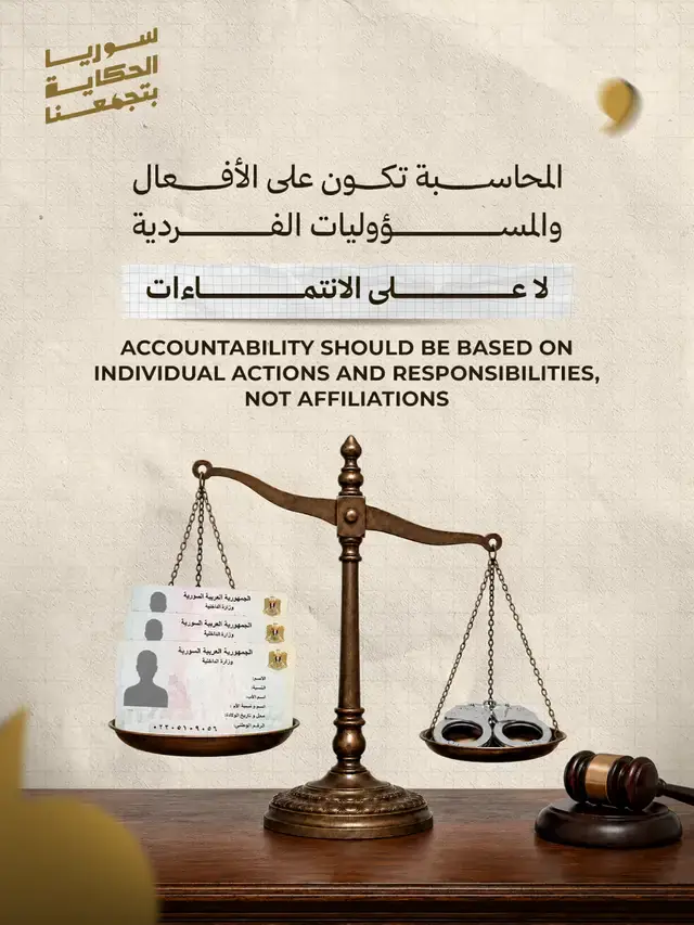
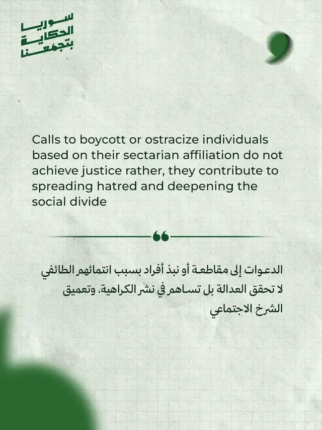
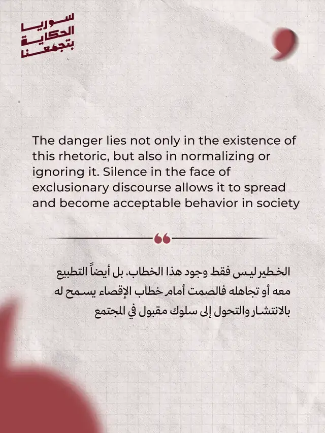
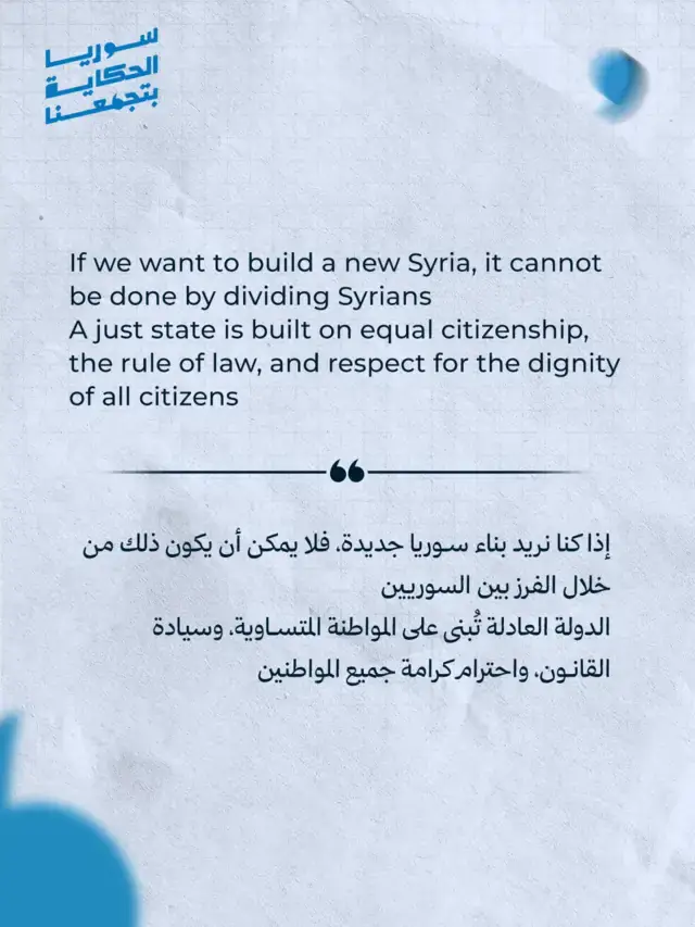
On the platforms, the content splits in two. A single post carries one idea you can read in a second: a name, a line, a map. A carousel takes its time: it opens with a question on the first slide, builds the argument slide by slide, and closes on the line we started from. The pattern runs through both, so the voice stays the same no matter how the format changes.
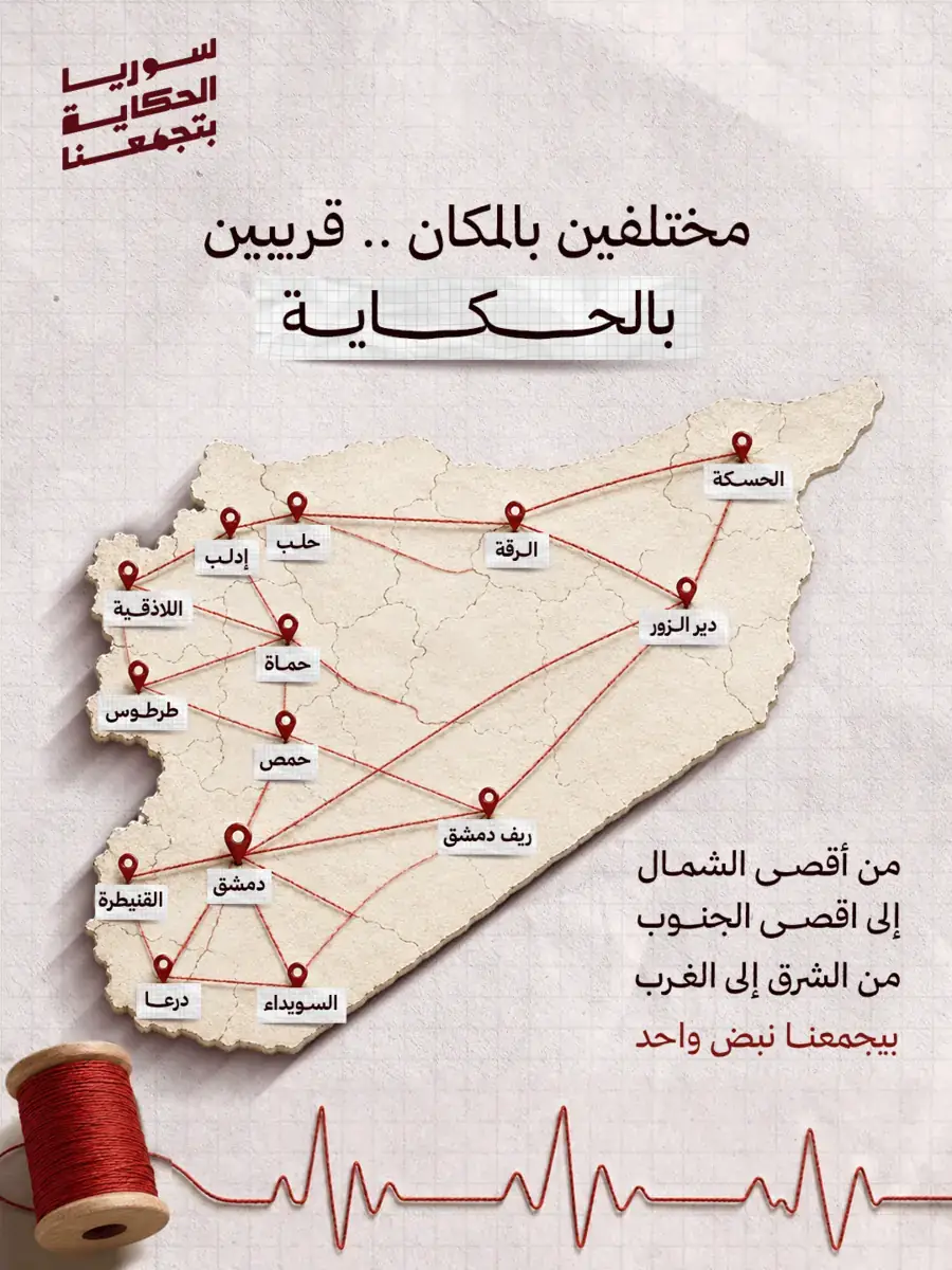
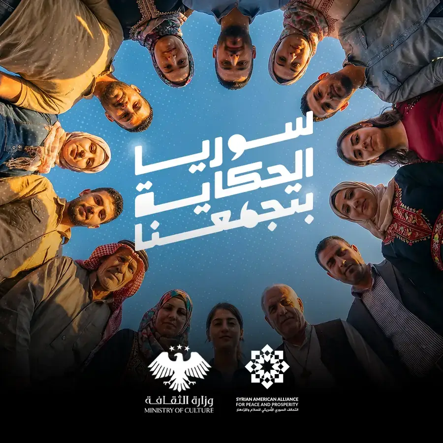
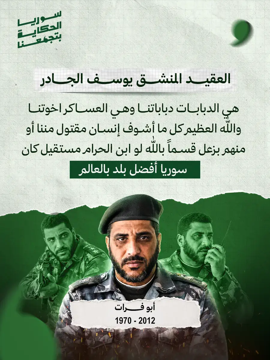
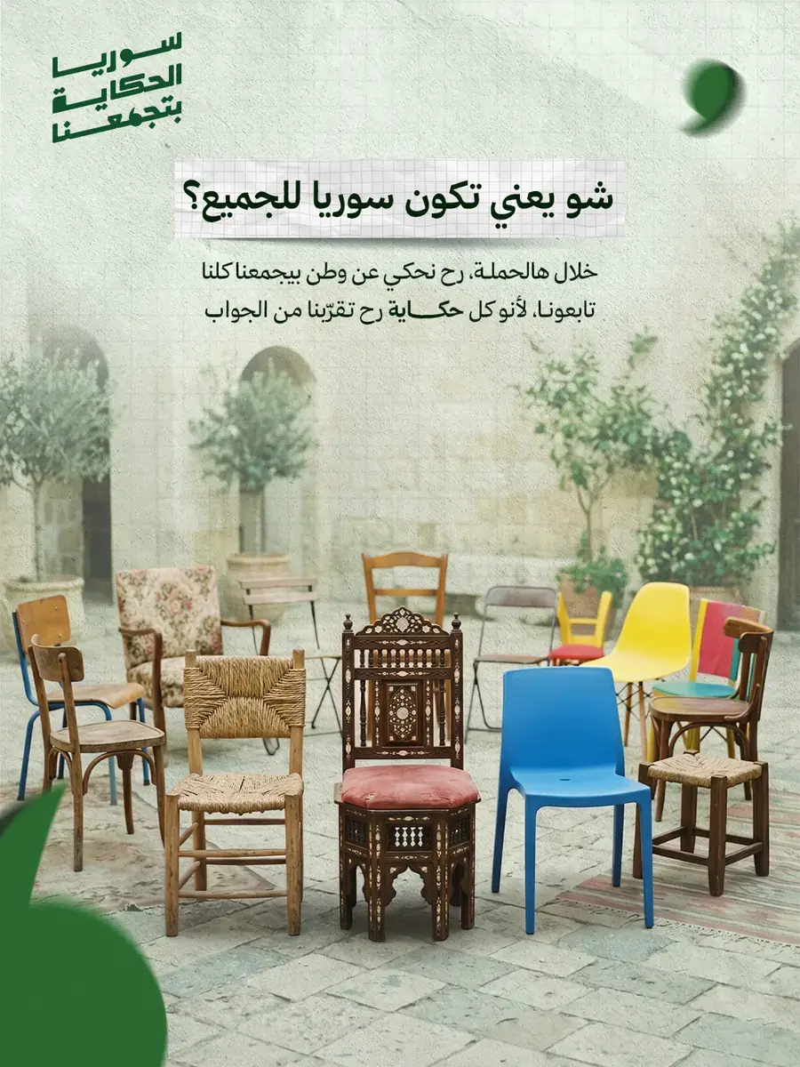
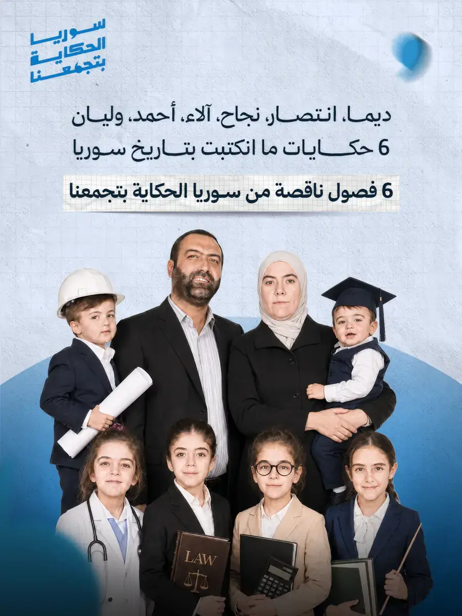
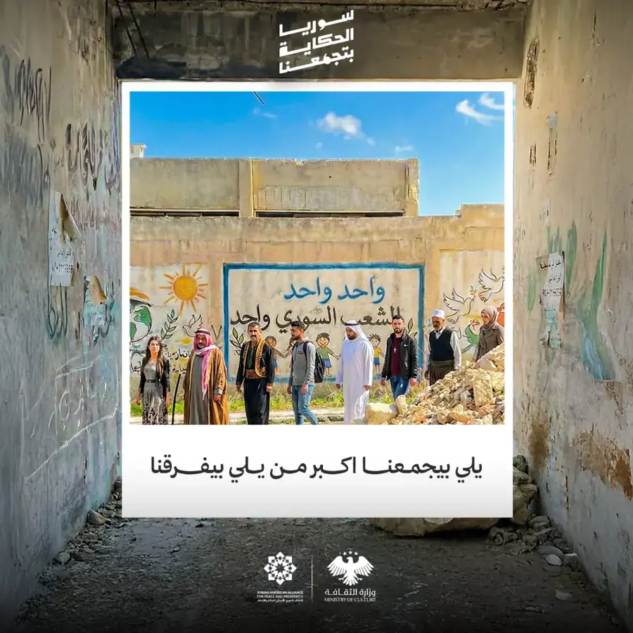
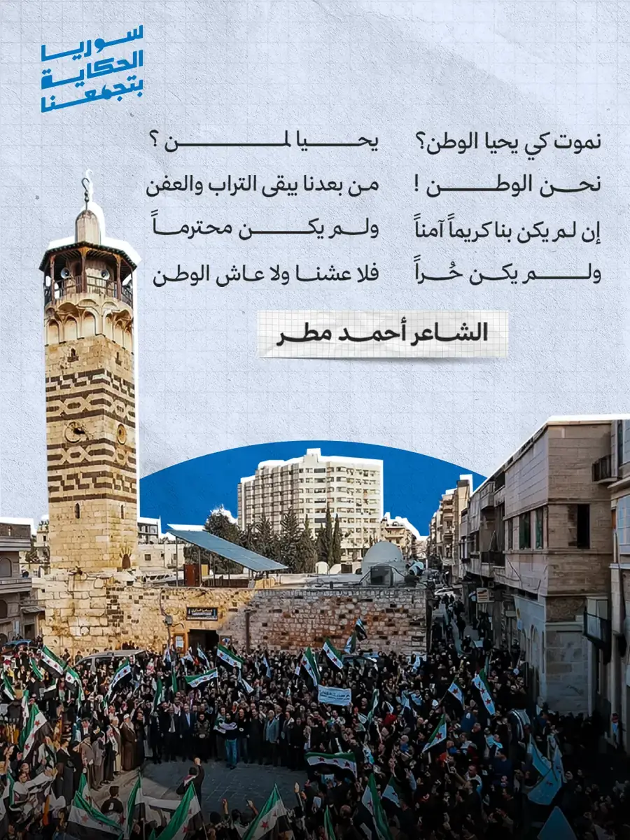
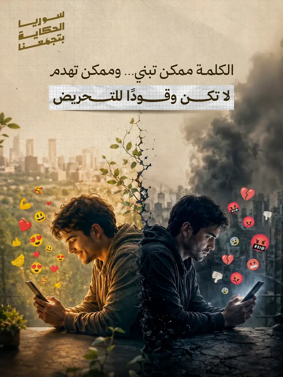
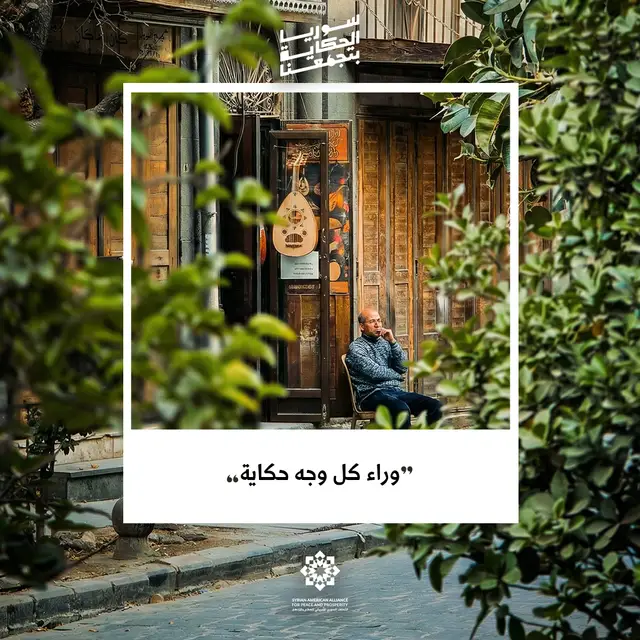
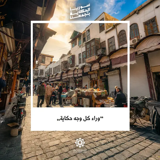
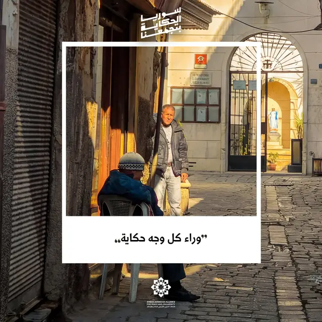
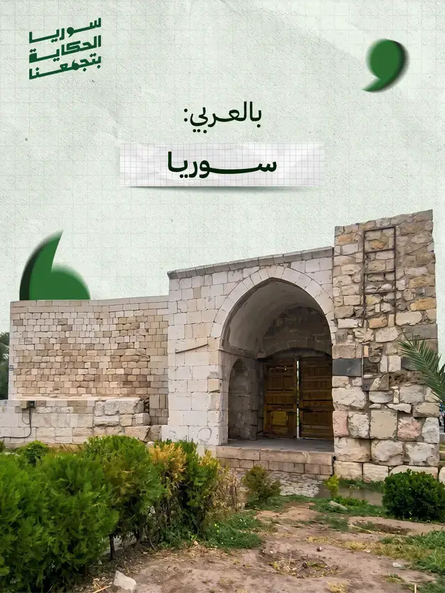
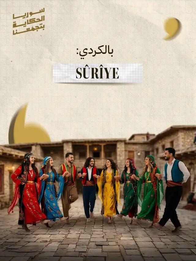
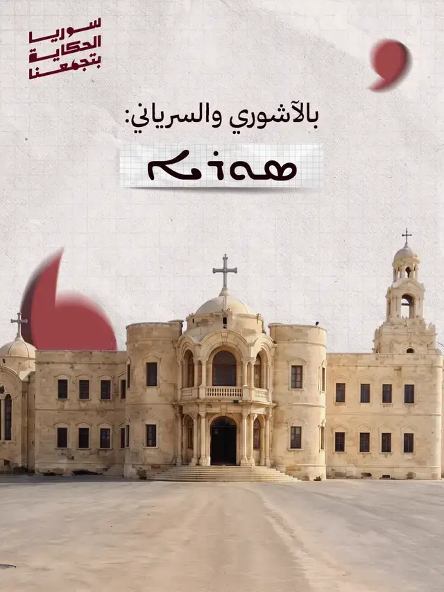
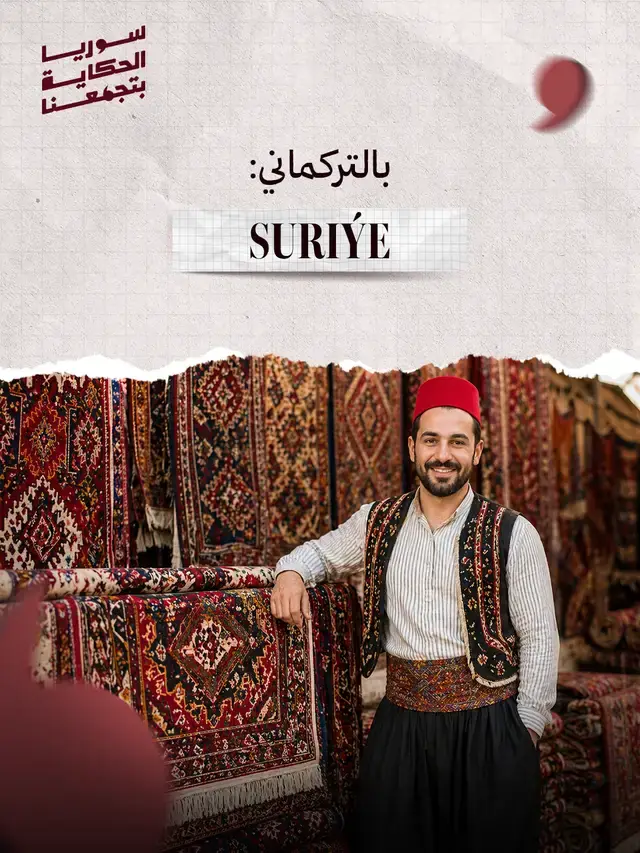
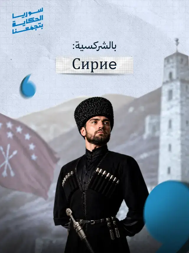
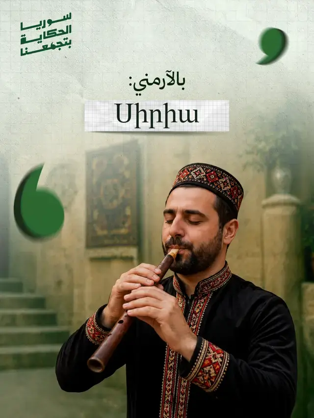
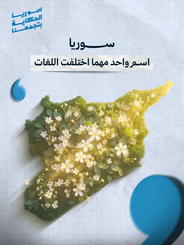
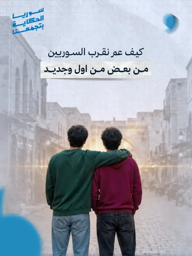
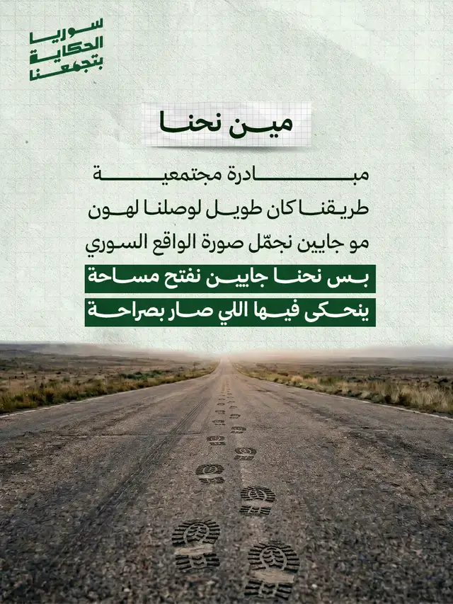
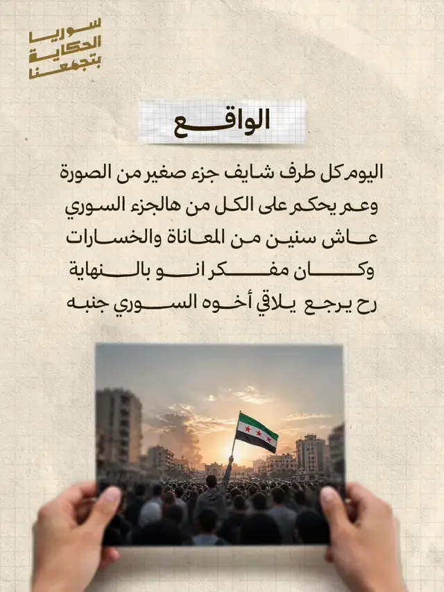
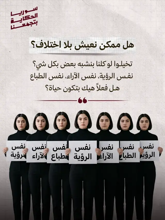
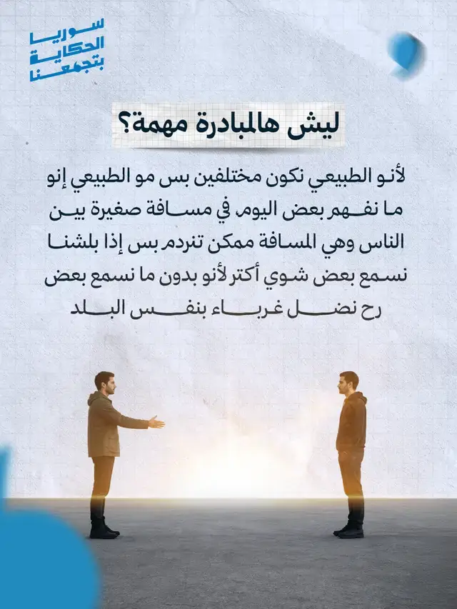
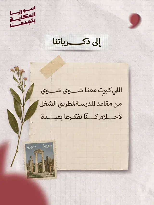
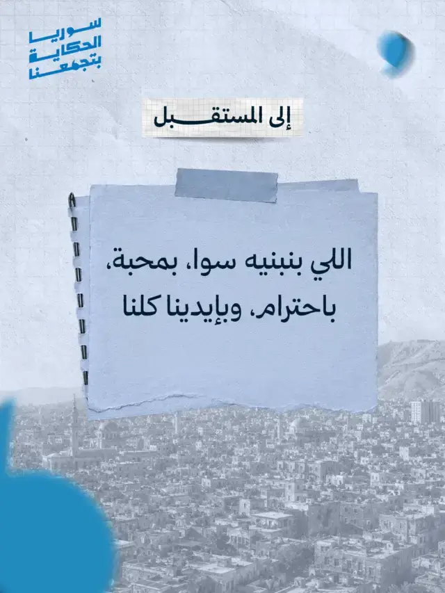
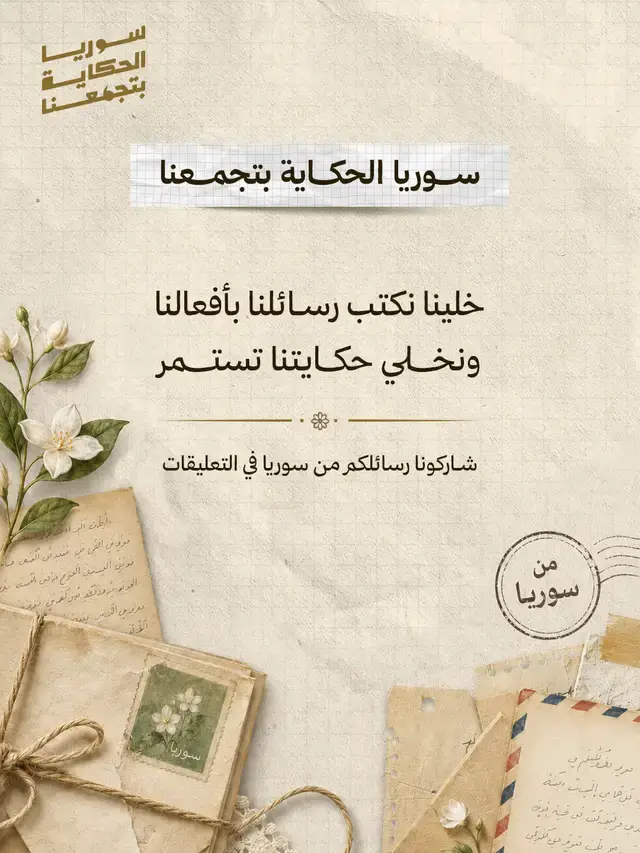
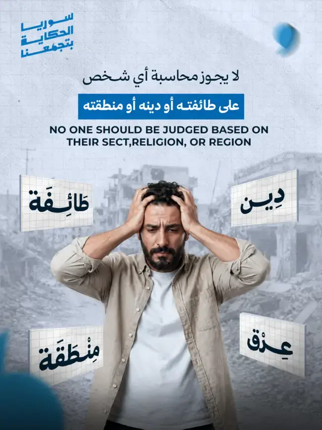
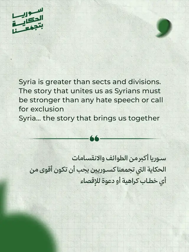
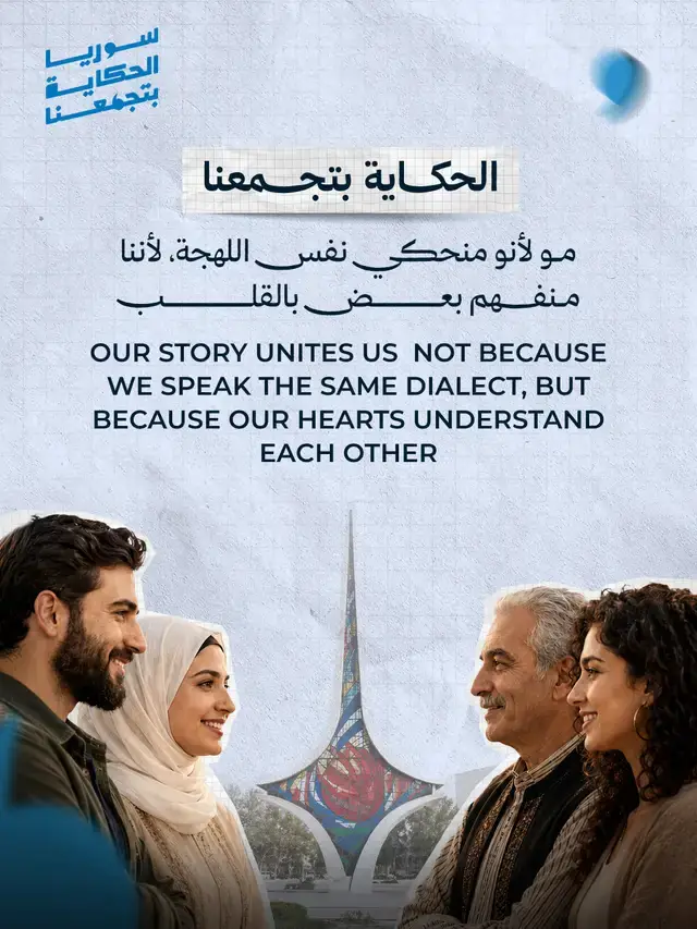
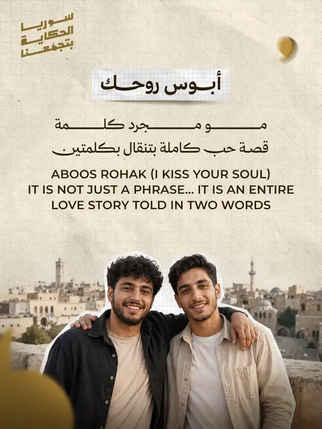
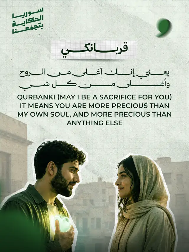
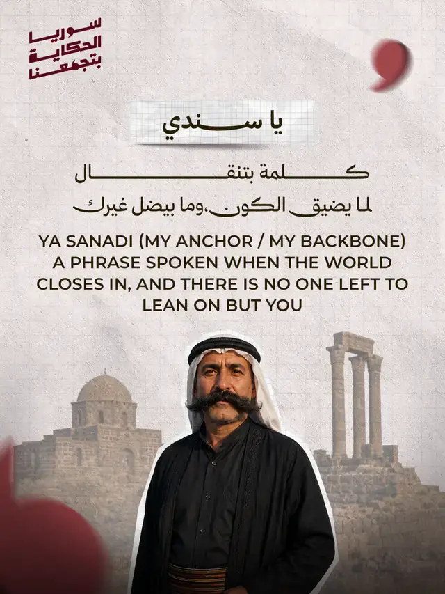
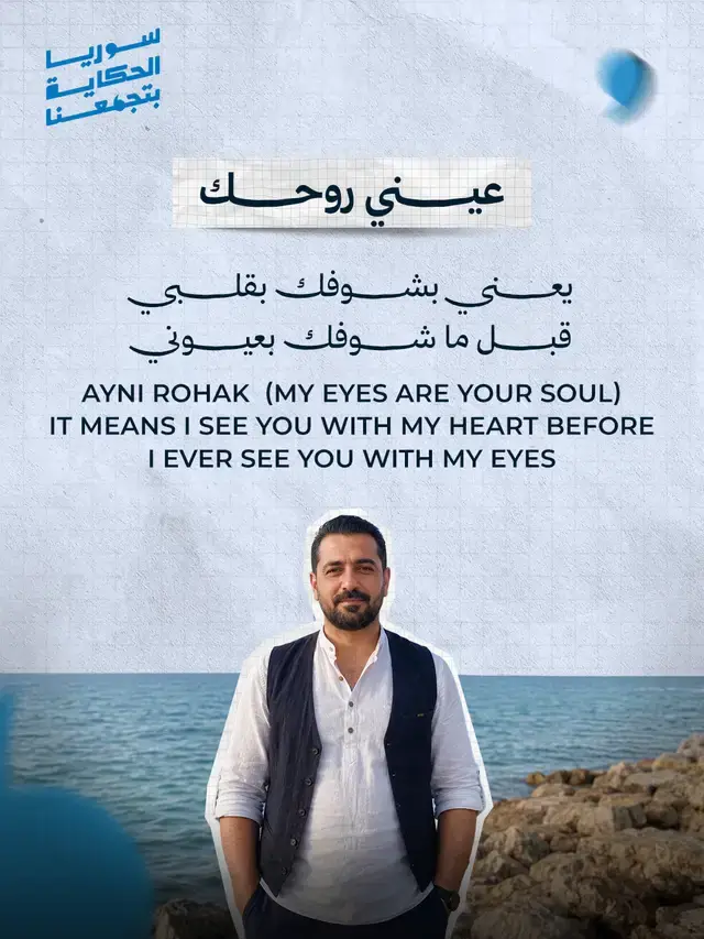
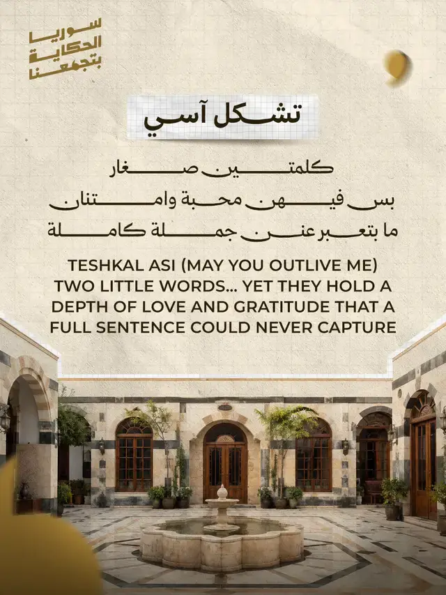
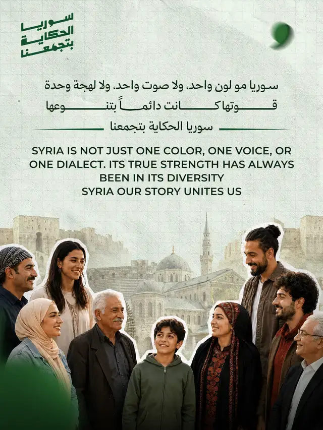
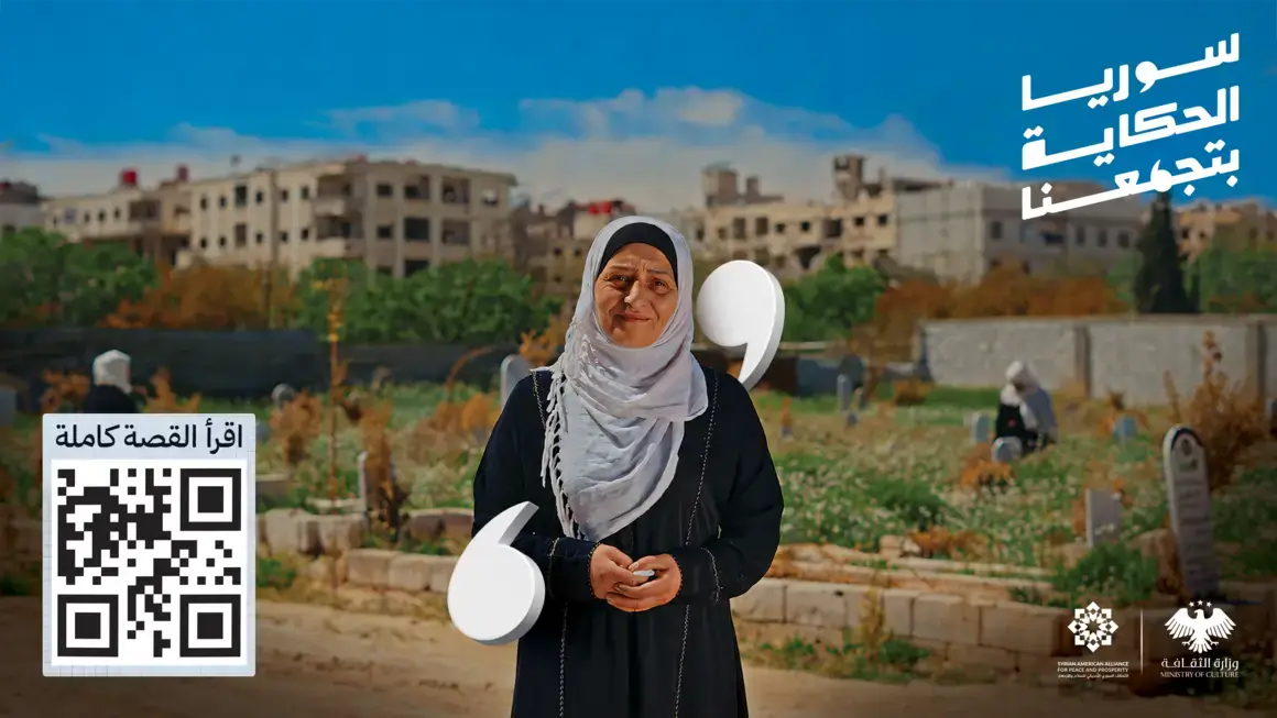
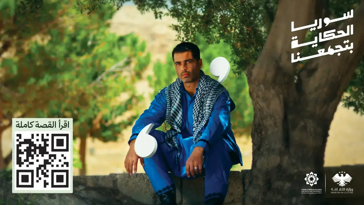
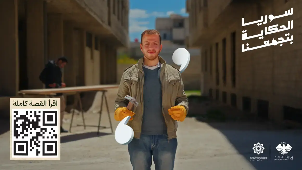
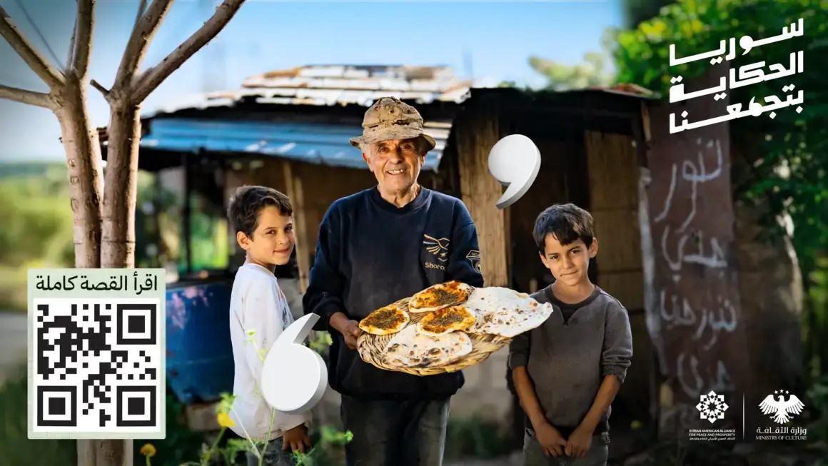
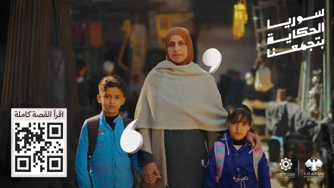
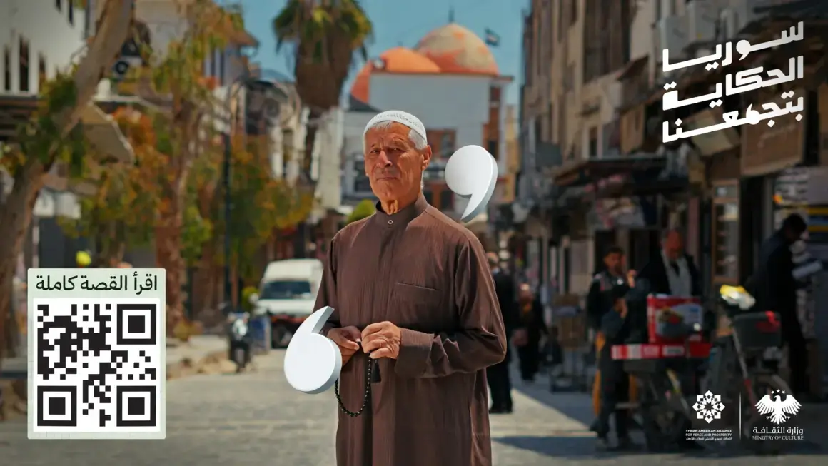
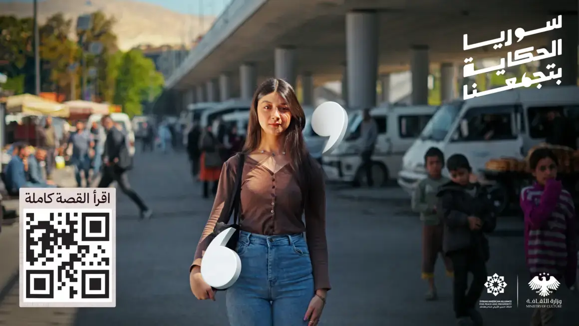
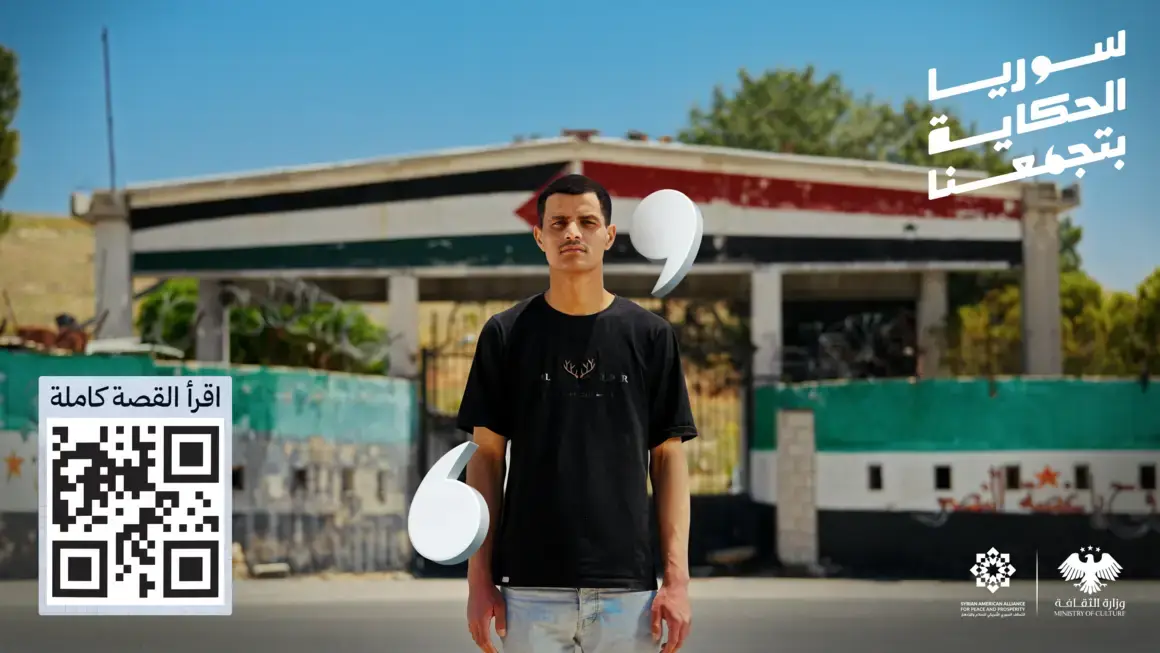
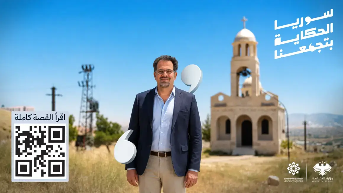
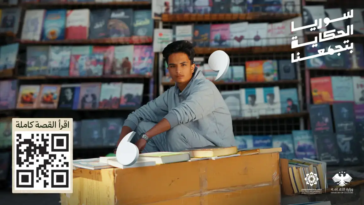
The billboard doesn't carry a slogan alone. It carries a real face in its real place, white quotation marks floating around it as if the story were quoted from the street itself, and a single QR code with one line beneath it: "read the full story". The board catches the eye in a second, and the story gets read on the phone afterwards.
Drag sideways to browse the boards →
No studio, no white backdrop. Everyone was photographed where they live: outside their home, their school, their market stall.
The same mark from the logotype appears in white inside the image, tying each board back to the wider system.
No phone number, no list of handles. One way in: scan the code and read the full story.
Every road ends in the same place: the campaign site, where each story can be read in full, in its teller's own voice. The board on the street, the post on the phone, the film on the screen, all of them doors into the same room.
The platform accounts are still going live, so the links here aren't active yet. We'll add them to this page as the campaign rolls out.
Syria isn't told in a single story. It's told in all the stories at once, and that is exactly when it comes together.
Got a campaign that needs to reach all of Syria, not just one audience? That's exactly the kind of work we do.